![[Jcount.com]](https://www.jcount.com/wp-content/uploads/2014/08/jcount150X50.png)
![[Jcount.com]](https://www.jcount.com/wp-content/uploads/2014/08/jcountstartupslogo1.png)


As a discerning businessperson, you likely don’t need to be told about the importance of a website to your company. It is a fundamental, an online presence that not only represents you but can help bring new business your way.
Unfortunately, knowing it’s necessary is not the end of the road. You can’t just put “do a website” onto a to-do list when you’re in the middle of starting a new venture. There is no perfect button to press that produces the kind of website that is going to be the best representation of you and your business. It’s not enough to just have any old website for the sake of having one.
Too many companies treat a website like a basic, and never extend it any further than that. They have one because a voice in the back of their mind is telling them that they need one. Yet at no point in the process have they actually thought about what they stand to gain from a website. Or, more importantly, the damage that a bad website can do to their company.
We live in a digital age, with many young people now classed as digital natives. Even if you are not tech-aware, billions of people throughout the world are. If you neglect your website, then you are signaling to a potential customer base that you are out-of-touch. You are saying: here is something I know I should have, but I haven’t put any further thought into it.
So let’s say you have your website. You’re going to have to visit it with fresh eyes, as if you have never seen it before. You don’t know what your company is, what it does or how it goes about its business. This is a totally fresh experience.
Now, be as critical as you can be and browse through the site. To begin with, look for the following information:
- What the company is
- What the company offers
- How to buy items or hire services from this company (delete as applicable)
- Who runs the company
- How to contact the company
It should take you no more than two minutes to be able to find all of that information. These are the basics; the fundamentals that you have to get right. At the heart of it, a website is a portal of information. It’s not unlike a digital version of a shop window. To extend the metaphor, you want people to see a clean display that they can immediately understand. You don’t want them having to peer through the darkness and gloom, trying to get some form of understanding of what’s going on. It needs to be obvious and at the forefront.
If you have designed the site yourself or use a template, then it is likely going to be lacking in other ways. One way to combat the following issues is to hire a professional to design a site for you. This is such a vital area, and one to invest in, so be willing to find out more about using a pro.
So let’s say you have met the above requirements with your site. Even if you can satisfy the basic information, sites that rely on only this are going to suffer. You can’t throw up a basic page of text and nothing else, and think because you pass the above test, you’re done.
Continue looking through the website, because it’s time to delve deeper into the things you should be seeing. And, just as importantly, the things that you shouldn’t.
Is the text readable? Easily readable?
If the text is anything but a dark color on a pale background, then you’ve got problems. Those with a poor site will struggle to read anything but this most basic of formats. Yes, it can look a little bit dull – but jazzy green text on a black background is not the place to put your personality onto the site. Use a blog section or create interesting pages if you’re yearning for a creative outlook.
How quickly does the site load?
If it takes more than five seconds, then you need to have a rethink. When visiting a site – particularly for a new company – people aren’t going to sit around and wait for it to load. The main page of the site should be free of clutter, animations, GIFs and anything else that can delay loading times. While you should have images on the site, they should be small enough to not delay loading times.
Does it look professional?
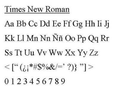
Steer clear of defaults – like Times New Roman as a font – if you want to look truly professional. A site should have simple lines, a readable font and images that don’t look like they were snapped with a phone camera. If you’re not sure what would constitute professional, then go and look at websites for companies in a similar sector to yours. You should begin to see a pattern of style, so you don’t want yours to stand out.
Is the spelling and grammar correct?
This might seem like a small detail, especially if you’re not in a business where the written word is important. You may not notice spelling errors, or don’t put anything by them if you do see them, but other people do. For some potential customers – your source of potential revenue – they are a very bad sign indeed. They signify that the business does not pay attention to detail, or perhaps even has a dismissive attitude of what others may think. Steer clear of using emoticons or emoji in text also – use words, and if you can’t, hire someone who can.

Only by viewing your website with fresh eyes and being critical can you experience it as a consumer. Keep the shop window idea on mind, and make sure you go back and check the view every so often. A site should be maintained, and ideally have a section to reflect that. The website is a thriving, active part of your business – not a box to tick and then forget about.
Link back to one of the bloggers posts, it’s not really a back link they would use on their own blog post.


