![[Jcount.com]](https://www.jcount.com/wp-content/uploads/2014/08/jcount150X50.png)
![[Jcount.com]](https://www.jcount.com/wp-content/uploads/2014/08/jcountstartupslogo1.png)

Photo by Luke Chesser on Unsplash
Web page size, or page weight, has been steadily increasing in the past years. According to recent studies, the average web page size in 2010 was 702kb compared to in 2232kb in 2016. Amongst resources such as JavaScript files, videos, and ads, the use of images is considered one of the main contributors to page weight.
Alongside factors such as the amount of bandwidth in transit, web page design, or the number of HTTP requests, the size of resources on a given web page, namely images, has a major effect on the load time of the pages on your site.
When optimizing your website, a good place to begin is to optimize the images on your web pages – a task that can boost your site performance dramatically. Here are five image optimization tips and techniques to deal with common performance issues related to images.
5 Ways to Optimize Images for Better Website Performance
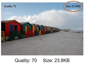
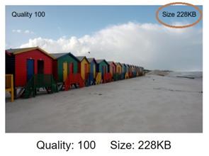
- Balance image quality and size. There is a fine line between displaying a quality image for all your users and delivering the optimal file size. Many sites deliver images that are too high in quality and thus load slowly. Attempting to deliver the smallest file size will sacrifice image quality, while creating very high-resolution images results in a wasteful file size that provides little noticeable quality improvement. File compression also lowers storage space and bandwidth needs. Unfortunately, there is no single quality setting that is optimal for all images on all platforms. For example, this 100% quality setting image creates a larger file than this 70% image – and without noticeable visual improvement:
2.Improve page delivery speed by reducing the amount of images on the site, and reduce the number of HTTP requests per page. Each individual image on a page requires a separate HTTP request. With programmatic changes such as CSS image sprites, converting images to Base64 code, and transforming logos into CSS code, you can reduce the number of load requests per page. The main target of such programmatic changes should be images used for design or functions, rather than photos on informational pages (such as articles), which are often called only once.
3.Lazy loading images. This may sound like a bad thing to do, but it’s not. Lazy loading is a way of stopping web objects like images from loading until the visitor needs to load them. For example, a web page loads the featured image at the top of the page so a visitor can scan the content “above the fold” and decide if they want to read further. As they scroll down, other images on the page are displayed. This speeds up page load time and enhances the user experience. If you use lazy loading, it is recommended to use JavaScript without JQuery, because loading the Jquery.js file slows down page speed. Should you need to load that library file for other actions on that page, JavaScript with JQuery is acceptable.
4. Automatic selection of the most efficient file format, a part of responsive imaging, is another image optimization technique. This requires creating master image folders with image files of different formats, quality and sizes. Depending on the browser, app or image content, you may want to change the file format. For example, using a WebP file for Chrome users and delivering a JPEG file for other browsers. The Cloudinary image management system can automate image quality on-the-fly to deliver efficient images to any platform.
5. Automatic scaling and cropping provides a way to deliver optimized images based on platform, page layout or image function. When displaying a thumbnail image, the original image may be too detailed. In this case, scaling or cropping for a thumbnail shows the user a more professional image. For example, if the original image is the New York city skyline, a thumbnail would be too small to see clearly. Cropping that image to show just the Empire State Building would retain the context and provide an easily viewed picture. Or, in conjunction with #1, creating images scaled for mobile, tablet and desktop browsers allows all users to see high quality images that load quickly on their devices. When images are optimized for each type of device, site performance improves. For example, loading a large, high resolution image onto the limited size of a phone screen takes much longer than using an image optimized for mobile devices.
Wrap Up
In this article, we illustrated the importance of image optimization to the crucial task of optimizing your site performance and speeding up your page load time. We discussed five image optimization issues that affect site performance, and introduced several techniques for dealing with these issues.
Have any more tips or insights regarding image optimization? Let us know in the comments!


