![[Jcount.com]](https://www.jcount.com/wp-content/uploads/2014/08/jcount150X50.png)
![[Jcount.com]](https://www.jcount.com/wp-content/uploads/2014/08/jcountstartupslogo1.png)
The iPhone app development has changed the face of the mobile industry. People are becoming increasingly addicted to the iPhone apps. people are recognizing many applications through their icons. It plays a key role in the iPhone app development, as it can easily create buzz in users and can attract them to use or download apps. it is very important that the iPhone app developers create an appealing and interactive icon designs. The icons of the iPhone apps plays a great role in creating a huge impact on the target audience and plays an important role in the success of the iphone apps. the following are some great tips to create effective iphone app icons.
- The first thing you need to do is familiarize yourself with the basic logo design rules for iOS devices. This is the most basic things that iPhone app logo designers should follow. You must know which kind of file formats for icons are accepted generally by the Apple store, which kind of icon corners are preferred. If you design the app logo without a basic understanding of the rules, then there are high chance of your icon getting rejected by the Apple App store.
- Never use any kind of typography in your logo designs. Technically an icon is a presentation of thoughts and words, therefore you have to try to conceptualize your icon in a more creative and better way instead of just using the typical words.
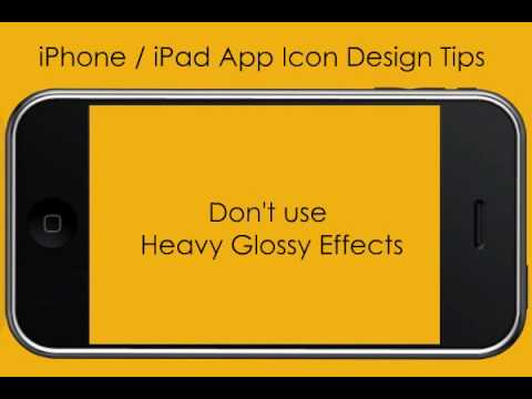
- Apple stores provides the app developers all the facilities to add a glossy look to the icon you are developing, but if you want to do it, then it is best to add such functionality on your own as this will help you in achieving more perfection.
- You must not go for a complex icon design, but rather try a simple and sophisticated icon design. The best advice for icon designers is that you make the icon simple, as it will help you create a professional look of your app icon and will be create a more appealing look. Remember users will not be interested in heavy graphical logos.
- Just do not forget to the icon size. iPhones have certain different icon size formats , therefore icon designers must not forget the size of the iPhone icon, 57 pixels is generally the most suitable for icons.
- You must not impose too much of color and graphics too in the icon design as too much of color and graphics will complicate the design and make the icon less appealing to the users.
- Never include real images in the icon, just try to add comparative images in your icon.
- You have to test the icon design on the iphone devices before releasing it.
- Consistency and stability in the icon designs and applications are very important which the icon designer must maintain.
So, if you are an iphone app designer then these killer hand tips for designing creative, impulsive and effective icons for your iPhone apps will be really helpful
