![[Jcount.com]](https://www.jcount.com/wp-content/uploads/2014/08/jcount150X50.png)
![[Jcount.com]](https://www.jcount.com/wp-content/uploads/2014/08/jcountstartupslogo1.png)
There are several ways for your business to increase sales and gain popularity, and one of the significant ones is banners or standees. Drawing attention from passersby can be effortless if they are displayed and placed correctly. Standees come in all shapes and sizes, and there is a lot of creativity that can go into their design.
Well thought out and planned standees are acommonelement of any stall at a trade show or exhibition, delivering a well-targeted, clear and concise message across to prospective or existing clients.
The Protocol
There are a few good practices to keep in mind while designing a banner. Take time out to think about the message that you will be putting on it.The banner should be given the same amount of attention as any of your other marketing material. While being placed amid bold colour and graphics, the message has to remain clear and easy to read. Someone viewing it from across the hall should be able to take note of it.
Always use the top of the banner to promote your company logo. Make sure to use high-resolution images for the company logo and products. The overall design of the banner should tie in with all your other promotional collateral, and it is best to keep the background colour in line with existing brand or corporate identity.
Making an Impact
The banner must be seen as having the same amount of impact as a newspaper advert, pamphlet or business card since they, indeed, have the potential to create it. As with any visual medium, the right combination of colour with bold and accentuating designs can increase their visibility.
Using the Right Colours
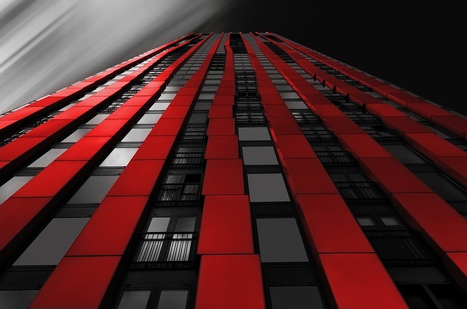
Red:Red signifies passion, fire and speed. It is a stimulating shade that might signify power, it is best used for a brand of product that inspires a sense of urgency and stimulation – such as food, retail, the entertainment industry, and, interestingly, telecommunications.
Green: Growth, nature, prosperity and peace are signified by the colour green. It goes without saying that green is the colour of choice when it comes to marketing anything in the name of fresh, natural, and healthy, and this might include bio-products, food products, and so on. Green is, however, a complex colour evoking a variety of emotions, and gives you a sense of both security and intrigue.
Blue:Blue is the colour of dependability, giving the buyer a sense of assurance, strength and tranquillity. Hence, it is no wonder that it is used in the identity of industries such as technology, engineering and automobiles; the banking sector also predominantly uses the colour blue in its branding. Even social media such as Facebook, LinkedIn and Twitter have blue-colored branding.
Yellow: Yellow is a colour associated with optimism, energy and sunshine. It is also a colour signifying treasure (gold). However, yellow can be considered too flashy since it can bother some viewers if used excessively. It is best used in a combination with other colours, such as black and blue, to give the overall design a sense of balance. Industries like travelling and exploration favour the usage of this colour.
Pink: Pink brings to your banner a youthful energy, due to its ability to make it look striking and intense. Paler shades of pink exude more of a girly sentiment and are to be used when designing for a predominantly female audience.


